
Broadsides for Rockwell, Helvetica & Garamond.
Second to last assignment for my MS in Information Design and Visualization at Northeastern University!
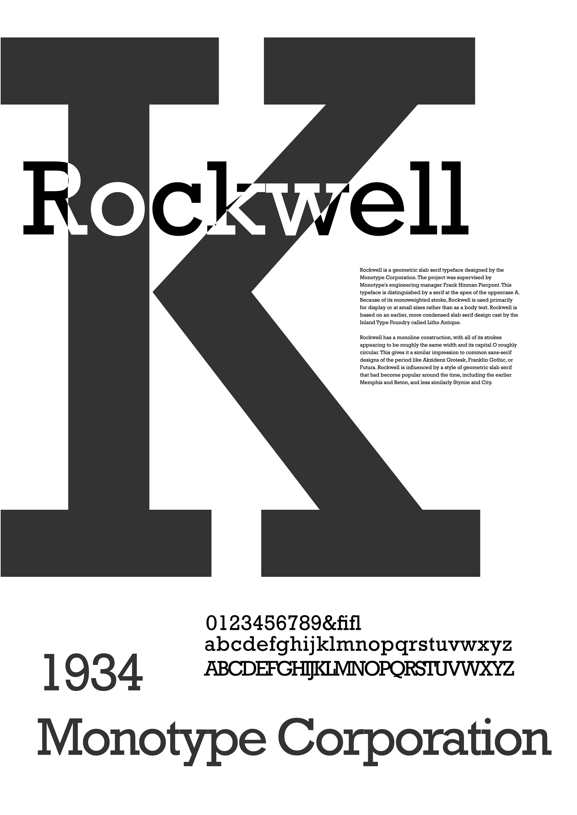
Rockwell
Monotype Corporation
1934
Rockwell is a geometric slab serif typeface designed by the Monotype Corporation. The project was supervised by Monotype's engineering manager Frank Hinman Pierpont. This typeface is distinguished by a serif at the apex of the uppercase A. Because of its monoweighted stroke, Rockwell is used primarily for display or at small sizes rather than as a body text. Rockwell is based on an earlier, more condensed slab serif design cast by the Inland Type Foundry called Litho Antique.
Rockwell has a monoline construction, with all of its strokes appearing to be roughly the same width and its capital O roughly circular. This gives it a similar impression to common sans-serif designs of the period like Akzidenz Grotesk, Franklin Gothic, or Futura. Rockwell is influenced by a style of geometric slab serif that had become popular around the time, including the earlier Memphis and Beton, and less similarly Stymie and City.
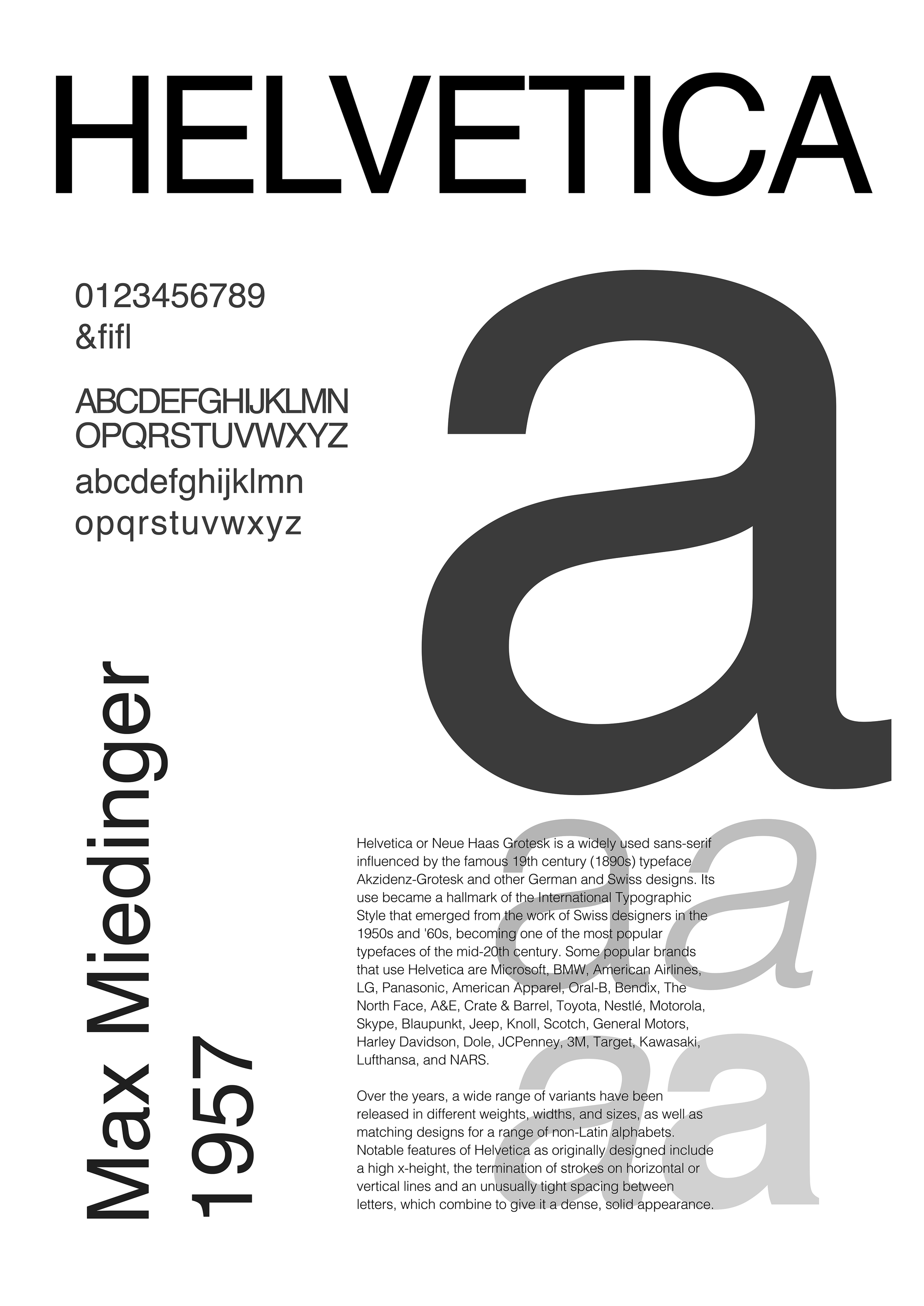
Helvetica
Max Miedinger
1957
Helvetica or Neue Haas Grotesk is a widely used sans-serif influenced by the famous 19th century (1890s) typeface Akzidenz-Grotesk and other German and Swiss designs. Its use became a hallmark of the International Typographic Style that emerged from the work of Swiss designers in the 1950s and '60s, becoming one of the most popular typefaces of the mid-20th century. Some popular brands that use Helvetica are Microsoft, BMW, American Airlines, LG, Panasonic, American Apparel, Oral-B, Bendix, The North Face, A&E, Crate & Barrel, Toyota, Nestlé, Motorola, Skype, Blaupunkt, Jeep, Knoll, Scotch, General Motors, Harley Davidson, Dole, JCPenney, 3M, Target, Kawasaki, Lufthansa, and NARS.
Over the years, a wide range of variants have been released in different weights, widths, and sizes, as well as matching designs for a range of non-Latin alphabets. Notable features of Helvetica as originally designed include a high x-height, the termination of strokes on horizontal or vertical lines and unusually tight spacing between letters, which combine to give it a dense, solid appearance.
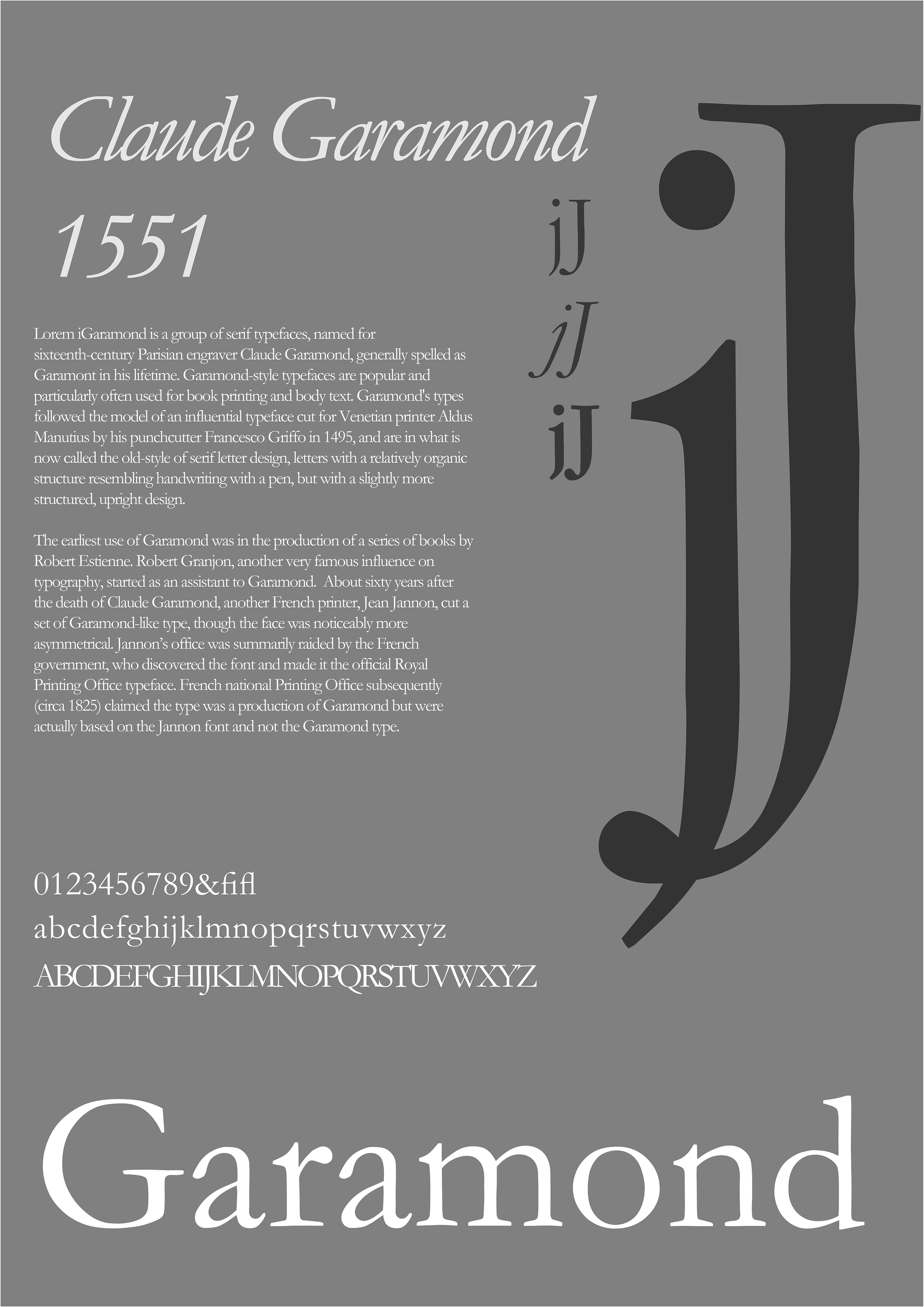
Garamond
Claude Garamond
1500s
Garamond is a group of serif typefaces, named for sixteenth-century Parisian engraver Claude Garamond, generally spelled as Garamont in his lifetime. Garamond-style typefaces are popular and particularly often used for book printing and body text. Garamond's types followed the model of an influential typeface cut for Venetian printer Aldus Manutius by his punchcutter Francesco Griffo in 1495, and are in what is now called the old-style of serif letter design, letters with a relatively organic structure resembling handwriting with a pen, but with a slightly more structured, upright design.
The earliest use of Garamond was in the production of a series of books by Robert Estienne. Robert Granjon, another very famous influence on typography, started as an assistant to Garamond. About sixty years after the death of Claude Garamond, another French printer, Jean Jannon, cut a set of Garamond-like type, though the face was noticeably more asymmetrical. Jannon’s office was summarily raided by the French government, who discovered the font and made it the official Royal Printing Office typeface. French national Printing Office subsequently (circa 1825) claimed the type was a production of Garamond but were actually based on the Jannon font and not the Garamond type.

